I, like many others, have been affected by the ongoing industrial dispute over Driver Only Operation (DOO) on Southern Railways. On some days this amounts to delayed or cancelled trains with extended journey times and the inconvenience of standing all the way into London and on others, like today, strikes leave no viable way of getting to work in London at all.
There have been many attempts to measure and demonstrate the impact of the industrial action such as the use of the #todayimissed hashtag on Twitter (see below), a recent passenger survey conducted by The Association of British Commuters and even a tongue-in-cheek video game. Whilst certainly compelling, these have all largely been qualitative rather than quantitative. I have heard tales of people losing or missing out on jobs due to continued lateness or based on where they live and, more recently, quite a lot of people moving job or house so they avoid Southern Rail for their commute to/from work. This got me thinking and I started to wonder whether there was any correlation between the industrial action and property prices in the affected areas.
#todayimissed saying goodnight to my children again #southernfail pic.twitter.com/hI1dCjLRid
— James Bowman (@JameseBowman) September 21, 2016
In recent years, the UK government has started publishing lots of their data, making it freely available to the public and developers to use for third-party applications. I visited www.gov.uk and found the UK Land Registry data for house prices available for download as a CSV file. This data set gives us the monthly average price of completed property transactions for each local authority. Unfortunately, this is a ‘trailing’ indicator as most property transactions take months to complete but it is a good place to start. The data is currently only available up until October 2016 with further data added each month (November’s data will be available later this month on the 17th January, December’s in February, etc.).
After downloading the Land Registry data and some basic manipulation in R we can visualise the geographical distribution of property prices (transactions) across Great Britan (as at October 2016) using OpenHeatMap. In this heatmap, shown below, the darker areas correspond to higher average property prices in transactions during October and conversely, lighter areas correspond to lower average prices.
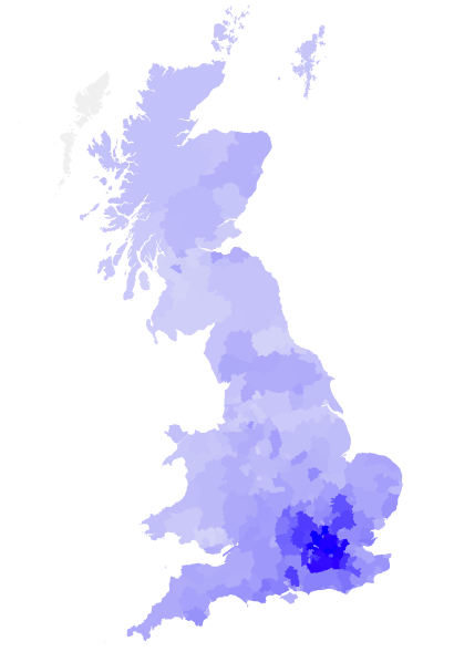
We can see from the visualisation that the average house price in and around London is higher than other parts of Britan. As Southern Rail extends into London it seems likely the average property price in the area served by Southern Rail will be higher than the national average. For our analysis, using the trend of house price movements over time will be more useful than absolute values.
Now we have the property prices by area, we need a way of comparing the nationwide prices with those for the area affected by the Southern Rail dispute. We need to define the affected area or, perhaps more specifically, the local authorities which include train stations served by Southern Rail. Hunting around the internet I struggled to find useable data on train routes or schedules until I stumbled across the data I needed on Wikipedia. Unlike most other sources I found, Wikipedia lists the stations served by each train operating company, rather than just the stations they operate. This is important, because Southern Rail trains serve a number of stations operated by London Underground and other operating companies.
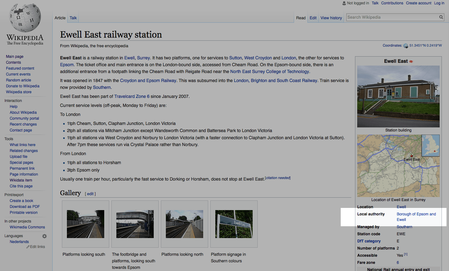
Wikipedia has a page for each station which contains relevant detail in the infobox vcard on the right (shown in the screen shot above) including the local authority that we can use to cross reference the Land Registry house price data. I did not fancy manually trawling wikipedia for the ~200 stations served by Southern so I wrote a simple Go program to crawl Wikipedia and scrape the data I needed.
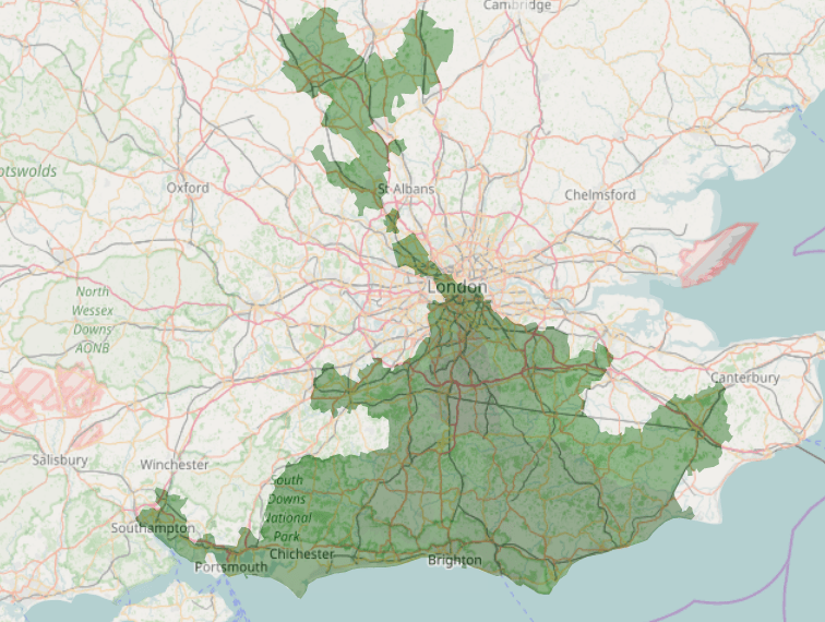
The result was a complete list of stations served by Southern and the associated local authority within which they reside. The area covered by these local authorities is shown in the map below.
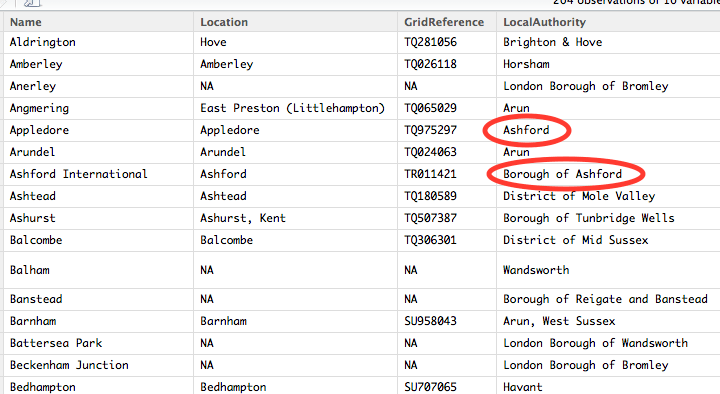
Unfortunately, there were a lot of inconsistencies in the data scraped from Wikipedia. Some of the Local Authority names did not match those used in the Land Registry data and were even inconsistent within Wikipedia between pages e.g. Ashford and Borough of Ashford, Brighton and Hove and Brighton & Hove, etc.
Some basic string manipulation in our R script allows us to clean up the wikipedia data and remove any inconsistencies. Once all of the inconsistencies have been removed and we are satisfied that every Local Authority in the stations dataset references a valid Local Authority from the Land Registry data, we are ready to cross reference the 2 data sets and visualise the results. I have plotted the average property prices by transaction since January 2016 up to and including October 2016 across local authorities served by Southern Rail and across Great Britan as a whole as a comparison. The resulting plot is shown below.
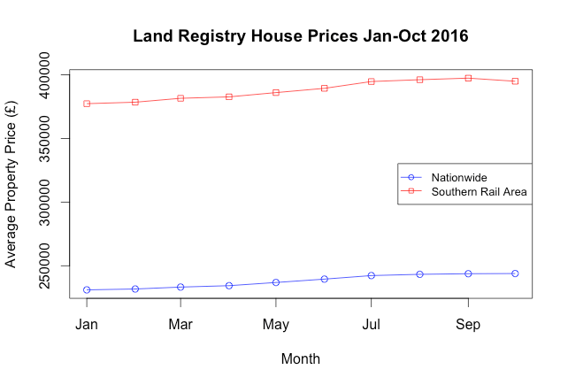
It is clear that, as we predicted, the average price for the area served by Southern Rail is higher than the national average. The two lines track almost identically except that in October, whilst the national average price continues to rise (albeit slightly), the prices in the area served by Southern Rail decline. To be specific, the decline in average property price transactions across the Southern Rail area between September and October in 2016 is £2446.66 or approximately 0.6%.
As with any results, these are open to interpretation and we must consider that this is only a single data point and a trend usually requires at least 3. Furthermore, we could argue that although the dispute has been going on since around April time, it is still too soon to see any impact manifest in property transactions (as it is a trailing indicator and we only have house price data up until October). This analysis assumes equal exposure to impact from train disruption across all local authorities but in practice, some local authorities will be more deeply affected than others with different percentages of the population relying on the trains. Considering census data on how people travel to work could be a future enhancement. Additionally, people residing outside the Southern area, but who drive to Southern train stations to catch trains are not accounted for in this analysis. Finally, and perhaps most importantly, we have identified a correlation and not necessarily a causation - any change observed in property prices is not necessarily as a direct result of the industrial action.
Whilst it is perhaps still too early to draw conclusions, I have enjoyed working with the data and will be interested to see what happens in the coming months as more data becomes available. The code used to process, cleanse, analyse and visualise the data is available on Github here. I hope you have found my experiences interesting, please share your own experiences or thoughts in the comments section below.